A budgeting website works best when it becomes the fastest place to re-enter the month
Browser-first budgeting is attractive for a simple reason: it reduces friction. There is no app install to maintain, no separate device ritual to protect, and no extra step between opening the dashboard and checking what changed.
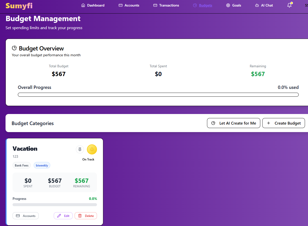
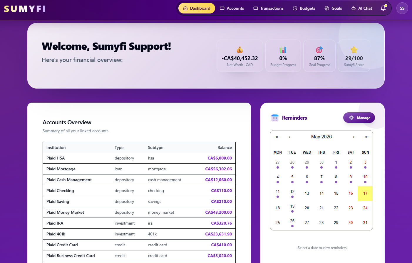
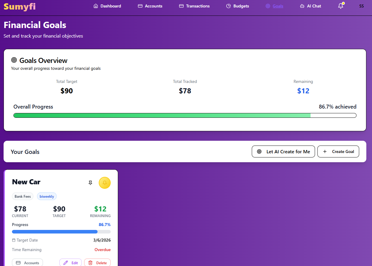
That convenience only matters if the website keeps the right context together. A useful budgeting website should make category drift, balances, recurring bills, and savings goals visible in one session instead of scattering them across separate views.
The stronger result is not the prettiest dashboard. It is the one that helps a weekly budget review restart quickly after a busy few days.
- Re-enter the month quickly from any browser
- Keep balances and categories in the same review pass
- Reduce the urge to fall back to spreadsheets
The page should make category pressure obvious before the month is over
A strong budgeting website does not wait until the end of the month to be useful. It should show which categories are warming up, which recurring bills are already shaping the next week, and whether the budget still reflects the cash that is actually available.
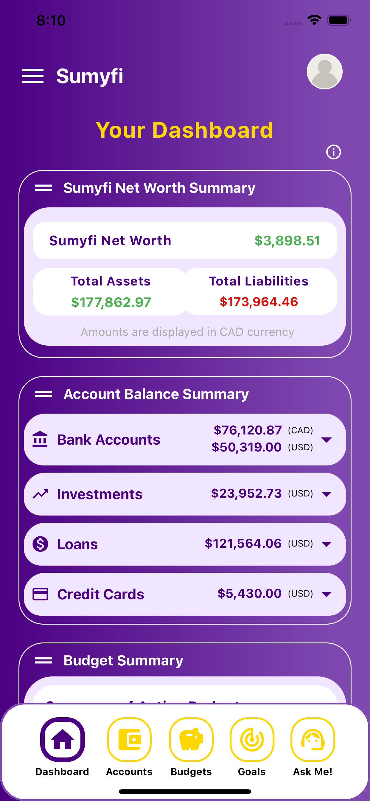
That is the practical test for browser budgeting. If the website only stores categories neatly but leaves the real account picture fuzzy, the review still depends on outside detective work.
The better workflow gives one clear orientation point: open the page, scan the pressure, and make one adjustment while there is still room to act.
- Spot category drift early
- Keep recurring bills connected to current balances
- Use one browser session to make one useful adjustment
A good budgeting website survives ordinary weeks, not just motivated setup days
The most common budgeting failure is not mathematical. It is behavioral. The routine becomes too heavy, too abstract, or too disconnected from what the bank accounts actually show, so the review stops happening.
A good budgeting website avoids that trap by staying quick to open and quick to interpret. It should still feel useful when the week is cluttered, the spending was imperfect, and there is only enough energy for one short pass through the dashboard.
If the website can still answer what changed and what matters next during a normal week, then it is doing real work.
- Design for repeat use, not setup-day optimism
- Prefer quick interpretation over endless configuration
- Keep the weekly review light enough to survive real life